SIDEBAR
»
S
I
D
E
B
A
R
«
The Minneapolis Star-Tribune's ROI on using GIS
Nov 15th, 2008 by analyticjournalism

Yes, yes. We know it's a promo piece for ESRI and the utility of GIS. But the article below from ESRI's ArcNews also highlights the company-wide utility of GIS for journalists, at least those who understand that what we do requires a wider vision than just writing well. Additionally, the article illustrates in-house expertise that folks in the newsroom could consider tapping


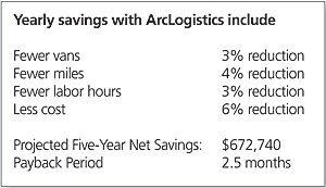
ArcLogistics Payback Period Is 2.5 Months for Newspaper Company

chart of savingsThe Star Tribune newspaper of Minneapolis-St. Paul, Minnesota, is using ArcLogistics GIS software to route its delivery drops. It is projected to save the newspaper more than a half million dollars in the next five years. By employing ArcLogistics in its efforts to serve the Minneapolis-St. Paul metropolitan region, greater Minnesota, and surrounding states, the Star Tribune has found that using GIS technology for intelligent routing has delivered an economic advantage to the company.


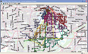
Using ArcLogistics, Star Tribune staff found that the existing newspaper delivery routes could be more efficient because some delivery trucks were unnecessary.

Given current economic trends, the company began looking for new areas where the newspaper could save money. Traditionally, the newspaper used wall maps with pushpins to determine delivery routes for single-copy papers. Rerouting was a time- and labor-intensive activity that required three employees from multiple departments to sit in the map room for four hours a day over the course of a month. Determining new routes is a necessity each time one of the seven advertisement zone boundaries is shifted or when a threshold amount of new or removed newspaper drop locations is reached. After reviewing several options to increase the efficiency of delivery routes, the Star Tribune partnered with Truck Dispatching Innovations, an ESRI Business Partner from Chicago, Illinois, to implement ArcLogistics. After a two-week startup period geocoding more than 3,700 delivery drop points and the routes of 39 trucks, employees used GIS to create new routes. These outcomes had many benefits. Using this new methodology, one staff member inputs a list of delivery route changes into ArcLogistics and, in half the time of the traditional method, creates and shares maps displaying new routes. The staff perform what-if scenarios, such as including different ad-zoned papers on the same truck. These reveal route options that could further increase the efficiency of delivery routes.

The Benefits of ArcLogistics


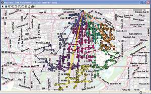
With the analytical tools of ArcLogistics, staff are able to decrease the number of delivery trucks on each route.

The Star Tribune expects a payback on its investment in 2.5 months and a five-year net savings of $672,740. This positive return on investment provides evidence showing the success of the venture to the company's financial director. The Star Tribune analyzed the benefits of its investment in ArcLogistics by measuring fixed and variable costs. Fixed costs include the lease price and maintenance expenses for delivery trucks, as well as the initial cost and yearly maintenance of the software. One variable cost is the number of miles driven, which determines gas costs per route. Another variable cost is the number of hours driven, which determines the wage cost per driver per route. Fixed costs are added to variable costs to determine route costs. Combining cost savings in these four areas shows a more accurate cost savings, rather than just looking at the savings as stand-alone figures. The Star Tribune found significant savings of route costs, including the number of trucks needed, miles driven, and time spent delivering newspapers.

More Information

For more information, contact Al Olson, fleet logistics manager, Star Tribune (e-mail: aolson@startribune.com), or John Handler, principal, Truck Dispatching Innovations (e-mail: jhandler@TDInnovations.com). To learn more about ArcLogistics, visit www.esri.com/arclogistics.


Librarians and "IT Professionals" – Getting to the root of it all
Nov 14th, 2008 by analyticjournalism

Amy Disch, library director of The Columbus (Ohio) Dispatch, sends along these links via the News Librarians' listserv (newslib@listserv.unc.edu).  This is a gentle reminder about how the foundations of good publications today rest, first, on the integration of library AND IT skills.

Watch them in the order listed:

  1. http://www.youtube.com/watch?v=VWY8OBMlroI
  2. http://www.youtube.com/watch?v=lYwoHCdIDKU
  3. http://www.youtube.com/watch?v=RFzHH5LRK2M&NR=1
  4. http://www.youtube.com/watch?v=p6uWmT2TXlQ


Craig's List had NOTHING to do with a decline in classified ad revenue.
Nov 14th, 2008 by analyticjournalism

IAJ co-founder Steve Ross has long argued that Craig's List HAS NOT contributed in a major way to the decline of North American newspaper advertising revenues.  Here's his latest analysis:

This isn't rocket science. Craig's List had NOTHING to do with a supposed decline in classified ad revenue.

Here's the raw PRINT classified revenue data, right off the NAA website. (If anyone doesn't use excel 2007 I can send the data file in another format, but everyone should be able to read the chart as a jpg).
Click here for bar chart

Note that the big change that pushed classified ad volume up in the 90s was employment advertising. Damn right. The country added 30 million new jobs in that period, and the number of new people entering the workforce declined because births had declined in the mid-1970s. More competition for bodies = more advertising needed.

Knock out the employment data and everything else stayed steady or INCREASED for newspaper classified.

The past 7 years were not as good for employment ads, but still better than in pre-web days.

There was indeed sharp deterioration in 2007 (and of course, 2001), as the economy soured.

There are some missing data (idiots) right around the time the web came in — 1993-4.

But just look at 1994-2006 — the “web years.” Total print classified ad dollar volume was $12.5 billion in 1994, $17 billion in 2006, roughly in line with inflation AT A TIME WHEN CIRCULATION FELL and even newspapers managed to get some new online revenue!!!

Look, I can do this with ad lineage (which didn't rise much at all but stayed ahead of circ declines), I can compare with display ad figures, I can do Craig's List cities vs non-Craig, I can add back the web revenue because in fact newspapers allocate revenue wrong, to preserve existing ad sales commission schemes, and thus undercount web revenue. I can do ad revenue per subscriber. And on and on.

All those corrections make this look even better for newspapers.

This is SO OBVIOUS that I just do not understand the “Craigs List has killed us” argument or even the”web killed us” argument.

It is (to me, anyway) a transparent lie. Either the newspaper barons are so inanely stupid that they don't understand their own business, or they are incompetent managers, looking for an excuse. Maybe both.

But oddly enough, Craig Newmark believes he did the damage. I've been on several panels with him where he has apologized for killing newspapers.

I might also add that some obviously web-literate societies are seeing a newspaper boom. Germany is an example.


O'Reilly Radar has a fine round-up of election mapping.
Nov 5th, 2008 by Tom Johnson

Mapping The Scenarios: Geo Resources For The Election

by Brady Forrest

nyt proportinal states map

If you're like me you'll be looking at maps and polls and news sites all day long on November 4th. As the polls close and some states go red vs. blue you'll be updating your mental map of the country. Below are some tools and data sources for simulating scenarios online.

New York Times – The Grey Lady has invested in a lot of great visualization tools. The map above shows the electoral importance of each state and their leanings. Their maps also let you create your own scenarios. So if you believe that Missouri will go Red change it and see how that effects the totals. If you want to reminisce check out their debate visualizations.

GeoCommons – An online geo-database and mapping tool has many pertinent data sets available including Early Voting Data and Active Registered Virginia Voters.

FiveThirtyEight – Nate Silver and his fellow bloggers have been doing a great job of reading the polls. They've called it for Obama, but this is based on their math not their affiliation. As states are tallied I am sure they'll be updating their simulations.

Electoral-Vote – Very similar to FiveThirtyEight, this site also aggregates polls, but applies a different algorithm. They even have a Data Galore section with CSV's of all data used on the site.

Twitter Vote Report – As mentioned yesterday this site will be collecting vote reports from people on the ground.

Google – If you want to see recent voting patterns, Google has made the US election since 1980 available. They've also released a number of other maps and an election portal. And of course don't forget Google Hot Trends.

Video Galore – If you want to watch the election news online Silicon Alley Insider and LifeHacker have collected the available streams.

http://radar.oreilly.com/2008/11/mapping-the-scenarios-geo-reso.html

2008 presidential election cartogram
Nov 5th, 2008 by Tom Johnson

 Mark Newman's 2008 presidential election cartogram page is available.

   http://www-personal.umich.edu/~mejn/election/2008

»  Substance:WordPress   »  Style:Ahren Ahimsa