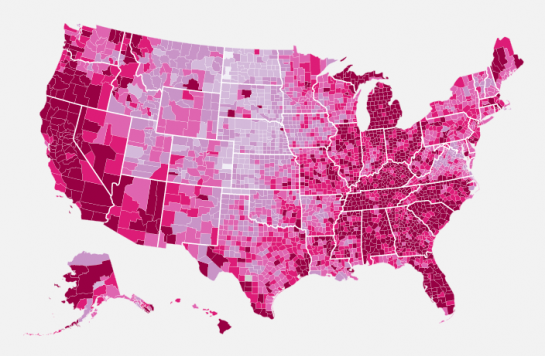
There are about a million ways to make a choropleth map. You know, the maps that color regions by some metric. The problem is that a lot of solutions require expensive software or have a high learning curve…or both. What if you just want a simple map without all the GIS stuff? In this post, I'll show you how to make a county-specific choropleth map using only free tools.
The Result
Here's what we're after. It's the most recent unemployment map from last week.

Step 0. System requirements
Just as a heads up, you'll need Python installed on your computer. Python comes pre-installed on the Mac. I'm not sure about Windows. If you're on Linux, well, I'm sure you're a big enough nerd to already be fluent in Python.
We're going to make good use of the Python library Beautiful Soup, so you'll need that too. It's a super easy, super useful HTML/XML parser that you should come to know and love.
Step 1. Prepare county-specific data
The first step of every visualization is to get the data. You can't do anything without it. In this example we're going to use county-level unemployment data from the Bureau of Labor Statistics. However, you have to go through FTP to get the most recent numbers, so to save some time, download the comma-separated (CSV) file here.