Nathan at FlowingData.com posts a nice collection of traffic mapping examples.
Explorations of real-world traffic

Traffic visualizations, mostly in the form of geographic maps, have been popular lately. Governments and organizations have been releasing lots of GPS data, and as a result, we get to see some impressive animations and explore some slick interactives.
We don't often get to see how cars, trains, subways, airplanes, etc move in physical space, because, well, we're usually in them, so it's always interesting to see the big picture. The activity feels very organic as traffic peaks during rush hours and slows down during the night, taxis provide service to and from the airport, and air traffic continues into the late hours. The maps pulsate with energy.
Let's take a look at some of these great traffic visualizations, some new and some old.
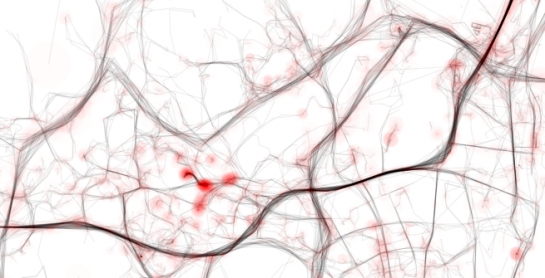
Traffic in Lisbon
Pedro Cruz's maps showing traffic in Lisbon (above) are the most recent on the list. They're another take on the ghostly trails aesthetic. Areas turn bright when there's more activity. Watch the animations play out over time.

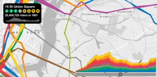
NYC MTA Ridership
Sha Hwang, now a part of Stamen Design, spun off of the fruminator's subway sparklines with a Modest Maps rendition of NYC MTA Ridership. Tracks get thicker with amount of estimated riders. Obviously, there's some interpolation going on.
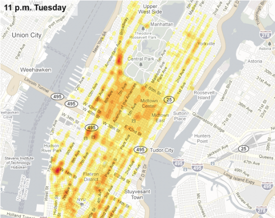
Tracking Taxi Flow
We saw this one by The New York Times fairly recently, made possible by a collaboration between Sense Networks and New York City’s Taxi & Limousine Commission.
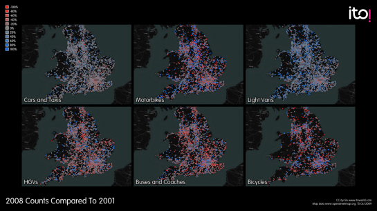
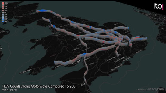
UK Traffic Flow
With the launch of data.gov.uk came a bunch of visualizations and applications. Ito World put together several maps that show car, bus, bicycle, and motorcycle traffic.
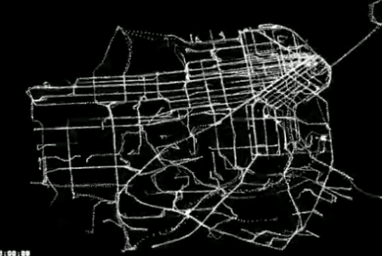
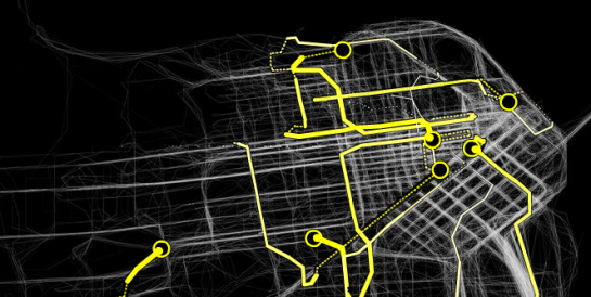
San Francisco Buses and Trains
Taco Lab had some fun with public transit data. The animation looks a lot like ants scurrying around in the dark.
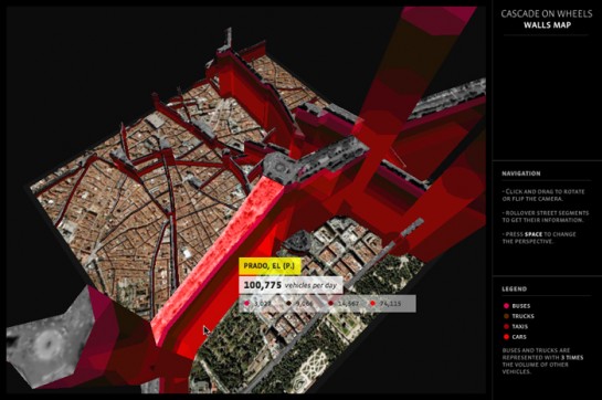
Cascade on Wheels
Cascade on Wheels by Steph Thirion and team was an effort during the Visualizar workshop to show traffic in Madrid's city center. In a bit of a different approach that we've seen, traffic was represented with rising “walls.”
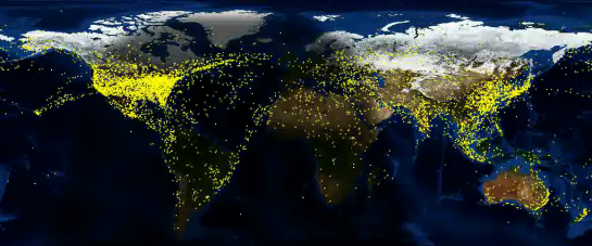
AirTraffic Worldwide
AirTraffic Worldwide by Zhaw shows just that. Each yellow dot represents an airplane, and air traffic dies down as the cloud of darkness called night passes over the region.
Britain from Above
Britain from Above by 422 South was created for a special segment on BBC. The series of videos revealed the ebb and flow of land and air traffic using GPS data.

Cabspotting
Of course we can't talk about traffic visualization and maps without mentioning Stamen Design's Cabspotting. Launched way back in 2006, previous cab trails are drawn in the background, with current cabs driving around the city.
Flight Patterns
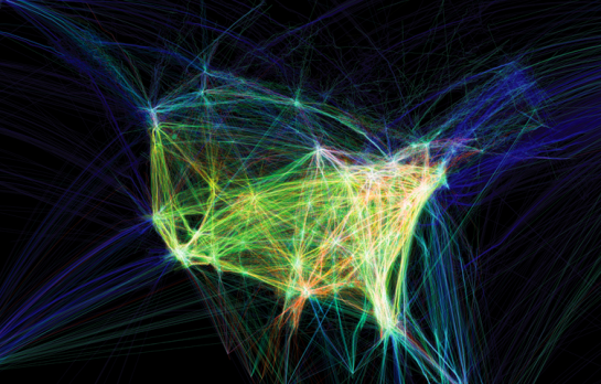
Finally, we can't forget Aaron Koblin's Flight Patterns, which (obviously) shows a day of flights in the United States according to an FAA dataset. It won a first place prize in the 2006 NSF visualization challenge.
See, I told you there was a lot of great stuff. Did I miss anything obvious? Leave a link in the comments below.