SIDEBAR
»
S
I
D
E
B
A
R
«
Race and ethnicity mapped by block
September 20th, 2010 by Tom Johnson

Census tract data and maps, while better than nothing, can often deceive because the size of the tract is greatly influenced by population size, not area. It is not uncommon that natural and constructed barriers — mountains or freeways — influence the movements and spatial demographics of a tract. Ah, but BLOCK data, now there is some fine, fine-grained data that we can use to extract insights and meaning.
Once again, Flowingdata.com tips us off to a good visualization of population data and the resulting maps.


Race and ethnicity mapped by block

Sep 20, 2010 to Mapping | Post on Twitter

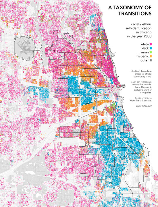
A taxonomy of transitions

Instead of breaking up demographics by defined boundaries, Bill Rankin uses dots to show the more subtle changes across neighborhoods in a map of Chicago using block-specific data US Census.

Any city-dweller knows that most neighborhoods don't have stark boundaries. Yet on maps, neighborhoods are almost always drawn as perfectly bounded areas, miniature territorial states of ethnicity or class. This is especially true for Chicago, where the delimitation of Chicago's official “community areas” in the 1920s was one of the hallmarks of the famous Chicago School of urban sociology.

Each dot represents 25 people of the map color's corresponding ethnicity.

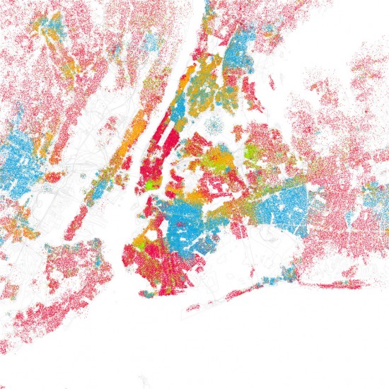
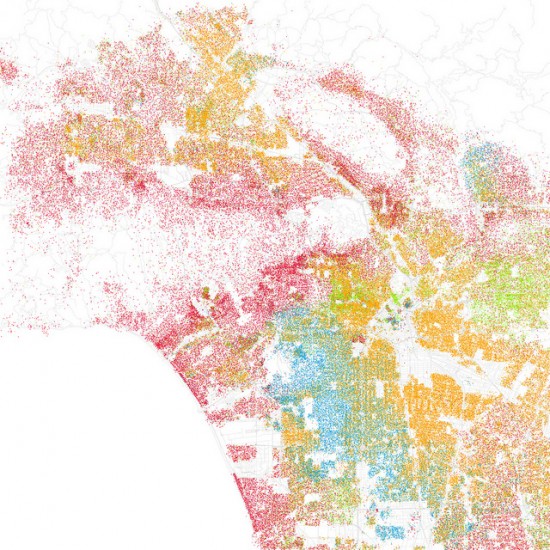
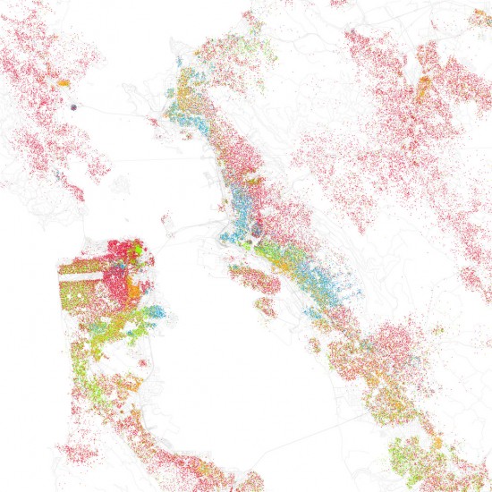
Eric Fischer takes the next step and applies the same method to forty major cities. Here are the maps for Los Angeles, San Francisco, and New York, respectively. Same color-coding applies. You definitely see the separation, but zoom and you much more subtle transitions.
[Eric Fischer via Data Pointed]


Leave a Reply

XHTML: You can use these tags: <a href="" title=""> <abbr title=""> <acronym title=""> <b> <blockquote cite=""> <cite> <code> <del datetime=""> <em> <i> <q cite=""> <s> <strike> <strong>

»  Substance:WordPress   »  Style:Ahren Ahimsa