SIDEBAR
»
S
I
D
E
B
A
R
«
Review: The Wall Street Journal Guide to Information Graphics
Feb 18th, 2010 by analyticjournalism

From FlowingData:


Review: The Wall Street Journal Guide to Information Graphics

Add another book to the growing library of guides on how to make information graphics the right way. Dona M. Wong, former graphics director of The Wall Street Journal and now strategy director for information Design at Siegel+Gale, provides the dos and don'ts of data presentation in The Wall Street Journal Guide to Information Graphics.

First Impressions

Given Wong's background, you can make a pretty good guess about the examples used. They're not graphics from The Journal but they do look a lot like them. The book description also makes a point of highlighting that Wong was a student of Edward Tufte, which was a big hint on what the book is like.

The guide is on the smaller side at about 150 pages of content, but it's mostly a visual book. There is about as much text as there are graphic examples, which I like. [more]


How-to: Turning Netflix data into map
Feb 8th, 2010 by analyticjournalism

From the Society of Newspaper Designers via FlowingData:

The making of the NYT’s Netflix graphic

January 20th, 2010

One of The Times’ recent graphics, “A Peek Into Netflix Queues,” ended up being one of our more popular graphics of the past few months. (A good roundup of what people wrote is here). Since then, there have been a few questions about the how the graphic was made and Tyson Evans, a friend and colleague, thought it might interest SND members. (I bother Tyson with questions about CSS and Ruby pretty regularly, so I owe him a few favors.)

Most readers are probably interested in the interactive graphic, although I will say that we also ran a lovely full-page graphic in print in the Metropolitan section, which goes out to readers in the New York region. That graphic had a lot of interesting statistical analysis – in fact, it would have been nice to get some analysis in the web version, more on that later – but for this I will focus mostly on the web version. If there are questions about the print graphic, I will make sure I get Amanda Cox to try to explain cluster analysis to me again.

First is the data itself. Jo Craven McGinty, a CAR reporter, was in contact with Netflix to obtain a database of the top 50 movies in each ZIP code for every ZIP in the country. That’s about 1.9 million records. The database did not include the number of people renting the movie – just the rank. (We [more here: http://www.snd.org/2010/01/nyt-netflix-graphic ]


More Visualization Links on Twitter
Jan 23rd, 2010 by Tom Johnson

Thanks to Steve Doig for the pointer to….

More Visualization Links on Twitter

By: Jeff Clark    Date: Sat, 23 Jan 2010

In a recent post I showed the Top 20 Individual Data Visualizations Mentioned on Twitter and remarked that many of the most frequently mentioned twitter links were to collections of visualizations. Shown below is a meta list of the top collection-type data visualization or infographic links.

Top Collections of Data Visualization Links

  1. 50 Great Examples of Data Visualization – Webdesigner Depot

  2. Data Visualization and Infographics Resources – Smashing Magazine

  3. 15 Stunning Examples of Data Visualization – Web Design Ledger

  4. 20 Essential Infographics & Data Visualization Blogs – Inspired Magazine

  5. Is Information Visualization the Next Frontier for Design? – Fast Company

  6. 28 Rich Data Visualization Tools – InsideRIA

  7. The Beauty of Infographics and Data Visualization – Abduzeedo

  8. 50 Great Examples of Data Visualization – Sun Yat-Sen University

  9. 20 Inspiring Uses of Data Visualization – SingleFunction

  10. 5 Best Data Visualization Projects of the Year – 2009 – FlowingData

  11. Data Visualization: Stories for the Information Age – BusinessWeek

  12. Data Visualization: Modern Approaches – Smashing Magazine

  13. The 21 Heroes of Data Visualization: – BusinessWeek

  14. 20+ CSS Data Visualization Techniques – tripwire magazine

  15. MEDIA ARTS MONDAYS:Data Visualization Tools – PSFK

  16. 37 Data-ish Blogs You Should Know About – FlowingData

  17. 5 Best Data Visualization Projects of the Year – FlowingData

  18. 30 new outstanding examples of data visualization – FrancescoMugnai.com

  19. Infosthetics: the beauty of data visualization – PingMag

  20. 5 Beautiful Social Media Videos – Mashable

Here are the top product type links in the field according to Twitter data between March 24 and Dec 31, 2009.

Top Data Visualization Product Links Mentioned on Twitter

  1. Axiis : Data Visualization Framework

  2. The JavaScript InfoVis Toolkit

  3. Microsoft – What is Pivot?

  4. Many Eyes

  5. Roambi – Your Data, iPhone-Style

  6. Flare – Data Visualization for the Web

  7. Gapminder.org – For a fact based world view.

  8. SpatialKey – Location Intelligence for Decision Makers

  9. Tableau Software – Data Visualization and Business Intelligence

  10. SIMILE Widgets

and finally:

Top Data Visualization Websites Mentioned on Twitter

  1. Information Is Beautiful | Ideas, issues, concepts, subjects – visualized!

  2. FlowingData | Data Visualization and Statistics

  3. Information Aesthetics | Information Visualization & Visual Communication

  4. visualcomplexity.com | A visual exploration on mapping complex networks

  5. DataViz on Tumblr


Charting the Beatles
Main


How to Make a Heatmap – a Quick and Easy Solution
Jan 21st, 2010 by analyticjournalism

Thanks to Nathan at Flowing Data:

How to Make a Heatmap – a Quick and Easy Solution

How to Make a Heatmap – a Quick and Easy Solution

How do you make a heatmap? This came from kerimcan in the FlowingData forums, and krees followed up with a couple of good links on how to do them in R. It really is super easy. Here's how to make a heatmap with just a few lines of code, but first, a short description of what a heatmap is.

The Heatmap

In case you don't know what a heatmap is, it's basically a table that has colors in place of numbers. Colors correspond to the level of the measurement. Each column can be a different metric like above, or it can be all the same like this one. It's useful for finding highs and lows and sometimes, patterns.

On to the tutorial.

Step 0. Download R

We're going to use R for this. It's a statistical computing language and environment, and it's free. Get it for Windows, Mac, or Linux. It's a simple one-click install for Windows and Mac. I've never tried Linux.

Did you download and install R? Okay, let's move on.

Step 1. Load the data

Like all visualization, you should start with the data. No data? No visualization for you.

For this tutorial, we'll use NBA basketball statistics from last season that I downloaded from databaseBasketball. I've made it available here as a CSV file. You don't have to download it though. R can do it for you.

I'm assuming you started R already. You should see a blank window.

Now we'll load the data using read.csv().

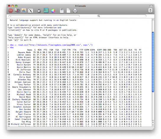
nba <- read.csv("http://datasets.flowingdata.com/ppg2008.csv", sep=",")

We've read a CSV file from a URL and specified the field separator as a comma. The data is stored in nba.

Type nba in the window, and you can see the data.
Step 2. Sort data

The data is sorted by points per game, greatest to least. Let's make it the other way around so that it's least to greatest.

nba <- nba[order(nba$PTS),]

We could just as easily chosen to order by assists, blocks, etc.

Step 3. Prepare data

As is, the column names match the CSV file's header. That's what we want.

But we also want to name the rows by player name instead of row number, so type this in the window:

row.names(nba) <- nba$Name

Now the rows are named by player, and we don't need the first column anymore so we'll get rid of it:

nba <- nba[,2:20]

Step 4. Prepare data, again

Are you noticing something here? It's important to note that a lot of visualization involves gathering and preparing data. Rarely, do you get data exactly how you need it, so you should expect to do some data munging before the visuals. Anyways, moving on.

The data was loaded into a data frame, but it has to be a data matrix to make your heatmap. The difference between a frame and a matrix is not important for this tutorial. You just need to know how to change it.

nba_matrix <- data.matrix(nba)

Step 5. Make a heatmap

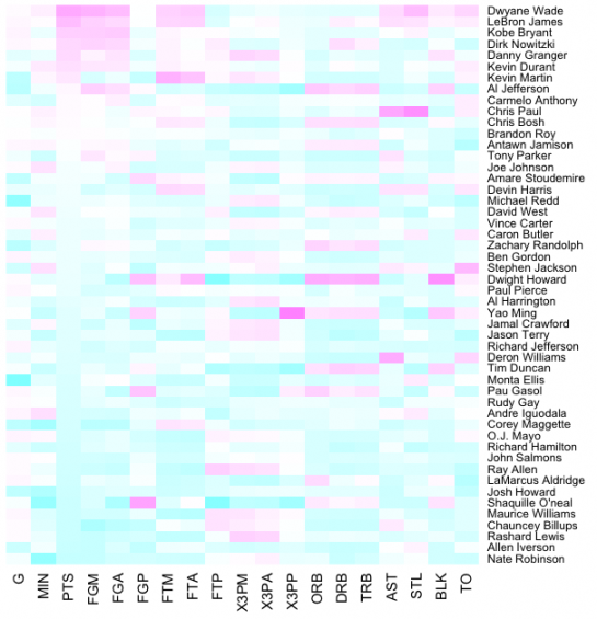
It's time for the finale. In just one line of code, build the heatmap (remove the line break):

nba_heatmap <- heatmap(nba_matrix, Rowv=NA, Colv=NA,

col = cm.colors(256), scale="column", margins=c(5,10))

You should get a heatmap that looks something like this:
Step 6. Color selection

Maybe you want a different color scheme. Just change the argument to col, which is cm.colors(256) in the line of code we just executed. Type ?cm.colors for help on what colors R offers. For example, you could use more heat-looking colors:

nba_heatmap <- heatmap(nba_matrix, Rowv=NA, Colv=NA,

col = heat.colors(256), scale="column", margins=c(5,10))
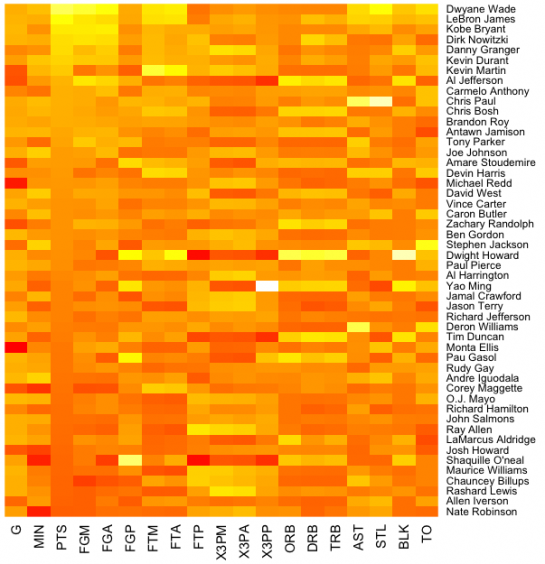
For the heatmap at the beginning of this post, I used the RColorBrewer library. Really, you can choose any color scheme you want. The col argument accepts any vector of hexidecimal-coded colors.

Step 7. Clean it up – optional

If you're using the heatmap to simply see what your data looks like, you can probably stop. But if it's for a report or presentation, you'll probably want to clean it up. You can fuss around with the options in R or you can save the graphic as a PDF and then import it into your favorite illustration software.

I personally use Adobe Illustrator, but you might prefer Inkscape, the open source (free) solution. Illustrator is kind of expensive, but you can probably find an old version on the cheap. I still use CS2. Adobe's up to CS4 already.

For the final basketball graphic, I used a blue color scheme from RColorBrewer and then lightened the blue shades, added white border, changed the font, and organized the labels in Illustrator. Voila.
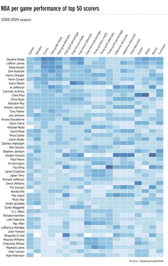
Rinse and repeat to use with your own data. Have fun heatmapping.


So what ARE people talking abouit
Jan 14th, 2010 by analyticjournalism

One of the things we've noticed about journalism operation that allow comments and discussion on their web pages is that few take the time to analyze that interchange and content.  Partially, that's because of a lack of tools.  The “tldr Project” is a step toward meeting that challenge.

Recent years have seen a proliferation of large-scale discussion spaces on the internet. With increasing user participation, it is not uncommon to find discussion spaces with hundreds to thousands of messages/participants. This phenomenon can be observed on a wide variety of websites – news outlets, blogs, social media websites, community websites and support forums. While most of these discussion spaces are able to support small discussions, their effectiveness is greatly reduced as the discussions grow larger. Users participating in these discussions are overwhelmed by the sheer amount of information presented, and the systems that support these conversations are lacking in functionality that lets users navigate to content of interest.

tldr is an application for navigating through large-scale online discussions. The application visualizes structures and patterns within ongoing conversations to let the user browse to content of most interest. In addition to visual overviews, it also incorporates features such as thread summarization, non-linear navigation, multi-dimensional filtering, and various other features that improve the experience of participating in large-discussions.

The current version of the application is functional for discussions on Reddit. This application will be released shortly. Until the application can be released, here is a video that presents many of the unique features built into the application. For best results, watch the video with HD turned on, or download a high-resolution version from Vimeo. More soon!

Here is a sample of patterns seen with the visualizations built into the application. Each of these visualizations present unique insight into the nature of the conversation, and help in discerning points of interest within a large conversation.


Narayan, Srikanth and Cheshire, Coye – “Not too long to read: The tldr Interface for Exploring and Navigating Large-Scale Discussion Spaces”. To appear in The 43rd Annual Hawaii International Conference on System Sciences – Persistent Conversations Track – Jan 2010

A fine how-to from FlowingData on making an "Interactive Area Graph"
Dec 9th, 2009 by analyticjournalism

Nathan, the guy behind the code at the FlowingData blog, offers up a good how-to set for producing interactive area graph.

How to Make an Interactive Area Graph with Flare

Posted by Nathan / Dec 9, 2009 to Tutorials / 3 comments

You've seen the NameExplorer from the Baby Name Wizard by Martin Wattenberg. It's an interactive area chart that lets you explore the popularity of names over time. Search by clicking on names or typing in a name in the prompt. It's simple. It's sexy. Everybody loves it.

This is a step-by-step guide on how to make a similar visualization in Actionscript/Flash with your own data and how to customize the design for whatever you need. We're after last week's graphic on consumer spending:

consumer spending

Audience

This tutorial is for people with at least a little bit of programming experience. I'll try to make it as straightforward as possible, but the concepts might be a little hard to grasp if you've never written a line of code. Just a heads up. Of course it never hurts to try.

If you don't care about customization or integration into an application and don't mind putting your data in the public domain, you could also just dump your data into Many Eyes, and use the Stack Graph.

Get Adobe Flex Builder

Like I said, this is all in Actionscript, so before we start anything, I strongly recommend you get Adobe Flex Builder if you don't already have it. You can buy it, get a trial version from the Adobe site, or if you're in education, you can get it for free.

There are ways to compile Actionscript without Flex Builder, but they are more complicated. [read more here]


Swimming in Data? Three Benefits of Visualization
Dec 4th, 2009 by analyticjournalism

Good piece on dataviz from Harvard Business Publishing.

John Sviokla The Near Futurist RSS Feed

Swimming in Data? Three Benefits of Visualization

4:11 PM Friday December 4, 2009

Tags:Information & technology, Knowledge management

“A good sketch is better than a long speech…” — a quote often attributed to Napoleon Bonaparte

The ability to visualize the implications of data is as old as humanity itself. Yet due to the vast quantities, sources, and sinks of data being pumped around our global economy at an ever increasing rate, the need for superior visualization is great and growing. To give dimension to the size of the challenge, the EMC reports that the “digital universe” added 487 exabytes — or 487 billion gigabytes — in 2008. They project that in 2012, we will add five times as much digital information as we did last year.

I believe that we will naturally migrate toward superior visualizations to cope with this information ocean. Since the days of the cave paintings, graphic depiction has always been an integral part of how people think, communicate, and make sense of the world. In the modern world, new information systems are at the heart of all management processes and organizational activities.

About ten years ago, I vividly remember visiting the Cabinet War Rooms in the basement of Whitehall, where Churchill had his war room during WW II. The desks were full of phones, and the walls covered with maps and information about troop levels and movements. These used color coded pieces of string to help Churchill's team easily understand what was happening:

cabinetwarrooms.jpg

On the one hand, I was struck by how primitive their information environment was only sixty years ago. But on the other, I found it reassuring to see how similar their approach was to war fighting today. The mode, quality and speed of data capture has changed greatly from the 1940s, but the paradigm for visualization of the terrain, forces, and strategy are almost identical to those of WWII. So, the good news is that even in a world of information surplus, we can draw upon deep human habits on how to visualize information to make sense of a dynamic reality. [more]


Could World of Warcraft be the new War and Peace?
Oct 2nd, 2009 by analyticjournalism

From the Nieman Foundation “Storyboard“:

Could World of Warcraft be the new War and Peace?

Whether Pacman or Halo first introduced you to video games, calling them “high art” might stretch the sensibilities.  But boardwalk nickelodeons led to movies like The Godfather—could a similarly radical transformation be underway with games?

Narrative journalism draws many of its core principles from novels, films, and short stories. Elements like character development, scene-setting, and a narrative arc work whether the tale is true or made up.

Games, however, are different.

“There are characters and stories in games, just like there are characters and stories in linear media, so it feels like you’re dealing with something that’s in the same ballpark,” says Chris Swain, associate professor at the University of Southern California’s Games Institute. “But I actually believe that they’re very different.”

Vintage Infographics From the 1930s
Sep 11th, 2009 by analyticjournalism

Nathan, over at FlowingData, has posted a fine example of infographics.  The work of Willard C. Brinton is a nice extension of what was being done by U.S. government agencies.  Turns out, Brinton's book can be found in used book sites, and at an affordable price.

Vintage Infographics From the 1930s

Posted by Nathan / Sep 11, 2009 to Infographics / 8 comments

Vintage Infographics From the 1930s

Someone needs to get me a paper copy of Willard Cope Brinton's Graphic Presentation (1939), because it is awesome.

Brinton discusses various forms of graphic presentation in the 524-page book and what works and what doesn't. There's also some good stuff in there about how to make your graphs, charts, maps, etc (by hand).

Have we seen these?

The most interesting part is that many of the graphics – despite having no computers in 1939 – look a lot like what we have today. Albeit, they're a little rougher because they're made by hand, but that's just added flavor.

For example, you've got the Sankey diagram above, or a “cosmograph” as Brinton calls it. The instructions read:

One thousand strips of paper are set on edge to represent 100% and are separated into component parts of 100%.

What? You want me to arrange 1,000 strips of paper to make my diagram? Brilliant, I say.

Here are your choropleth maps…

choropleth

network diagram…

network

and of course some of your usual suspects…

time-series

The entire book is freely available in PDF format, but it's low resolution and takes forever to browse. Michael Stoll has posted some higher quality shots on Flickr.

I still want more though.

Seriously, does anyone know where I can get a copy?

[via Datavisualization.ch]

Like what you see? Subscribe to the FlowingData RSS feed to stay updated on what's new in data visualization.


Some nifty Unemployment Charts from Jorge Camoes
Jun 19th, 2009 by analyticjournalism

Jorge Camoes is one of the serious folks when it comes to dataviz. Here's some work he's done recently in U.S. unemployment data. Note especially the good state-by-state dashboard. It quickly shows New Mexico is hangin' in there.

Here are two ways to display a relatively large dataset, montly unemployment rates by state since 1976. The first one is perfect to see the overall patterns, the range from the lowest to the highest, the outliers and the slopes. An interactive version would allow the user to highlight specific series.

A small-multiple version allows the user to focus on specific states, compare them to the normal band, etc. States are ranked by labor force size and, as you can see, in the first row seven out of ten are above the US average in April. In the last row, only one is above the US average. You can also see that Michigan was not well (unemployment-wire) long before the current crisis, or a spike in Luisiana (Katrina). It pays to study this chart carefully.

Bottom line: try to see the same data from different angles. There will always be semething interesting to find.

What do you think? How would you improve these charts? Would you use a different display? Share it in the comments! (here is the data file)

Update: I usually stay away from Excel’s surface charts, but I’d like to add this one:

Also check Michael’s Horizon chart.


»  Substance:WordPress   »  Style:Ahren Ahimsa